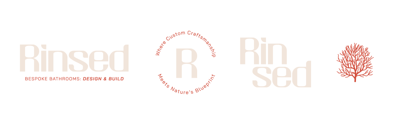
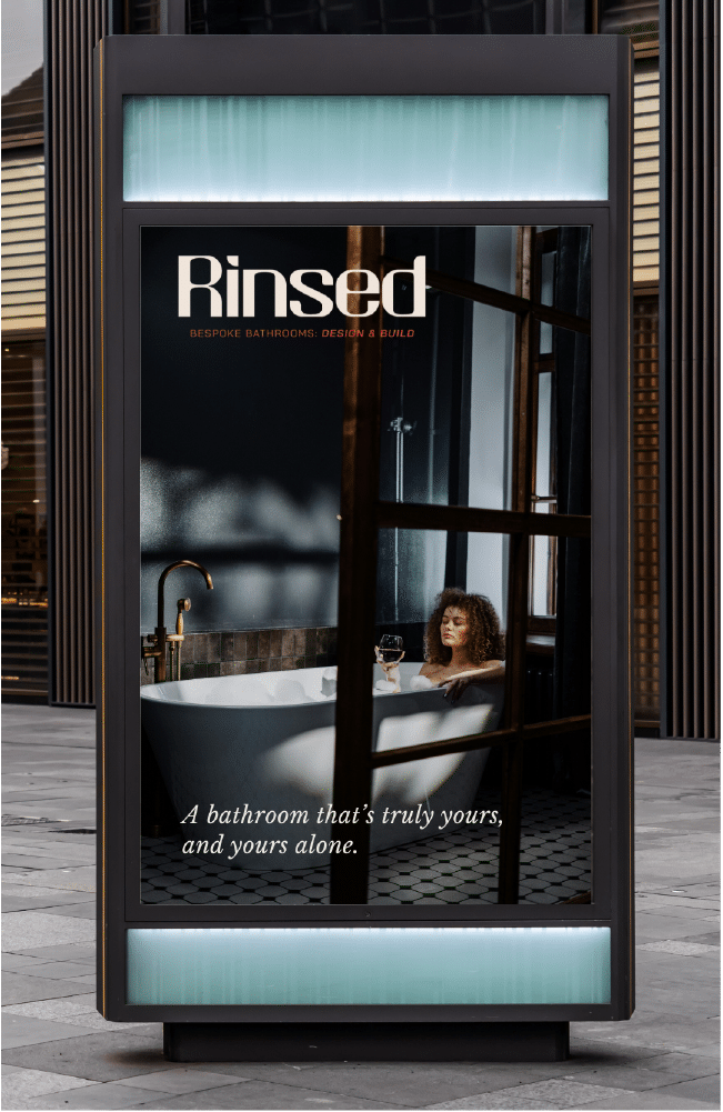
Crafting a brand that reflects timeless design, personal meaning, and natural beauty
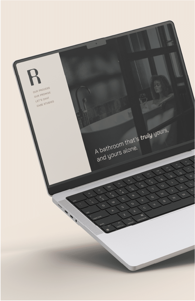
Rinsed is a new venture specialising in designing and building dream bathrooms. Their extensive experience from a well established building company, makes them stand out in the market by offering a unique combination of design expertise and practical building knowledge.
Objective:
-Design a visual identity that is trendy, current, and instantly recognisable, ensuring Rinsed stands out in the competitive market.
-Emphasise Rinsed as a unique blend of design and practical construction knowledge through visuals.
-Appeal to customers who are looking to be brave and bold in their bathroom design choices and who have a decent budget to invest in high-quality, innovative solutions.
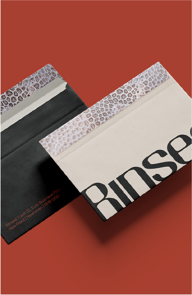
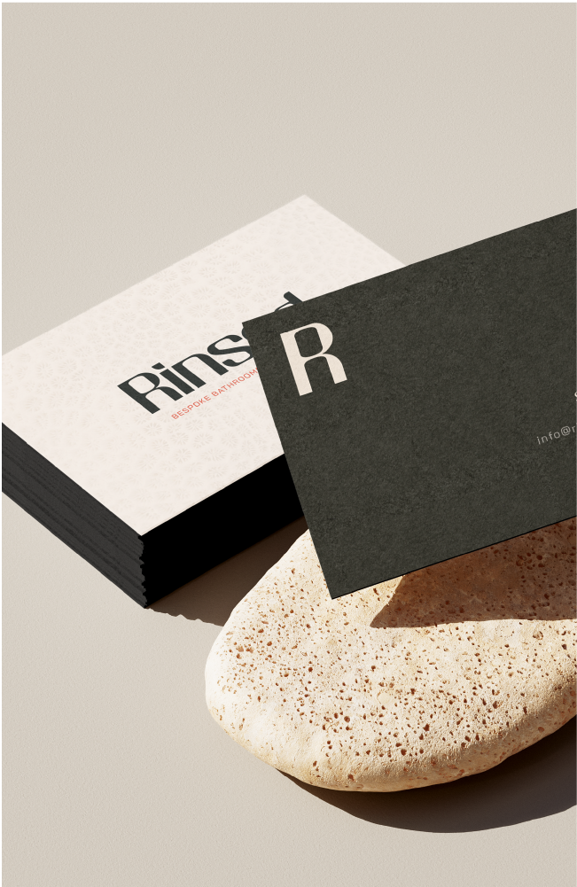
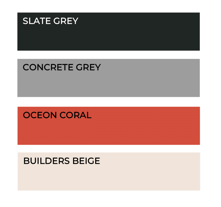
The colours
This colour palette strikes a balance between warmth and strength. The warmer tones create a welcoming feel, making Rinsed approachable and inviting. Coral-inspired accents evoke personalisation and natural beauty, adding a touch of trend and style. When blended with neutral shades like greys and beige, they connect nature with construction. This palette appeals to design conscious individuals seeking an innovative, bespoke service.
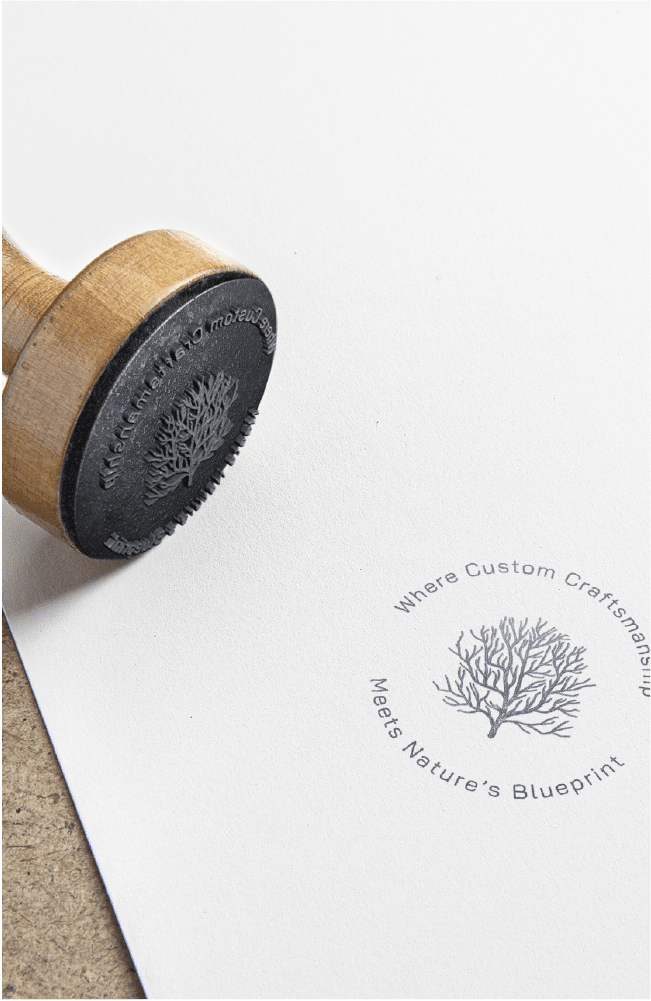
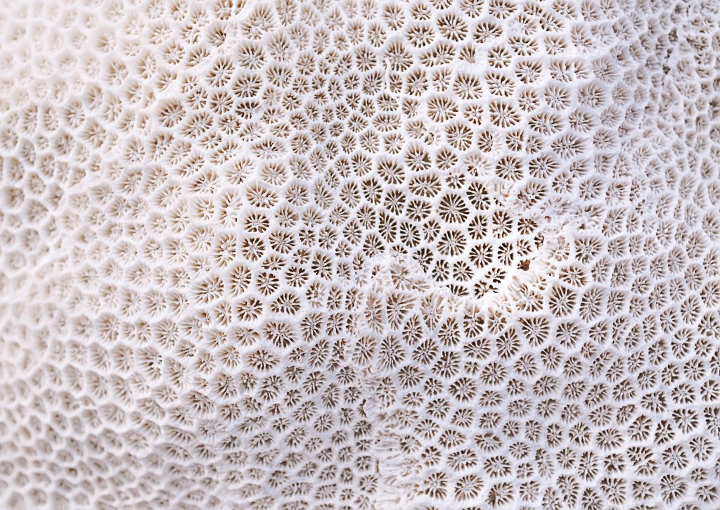
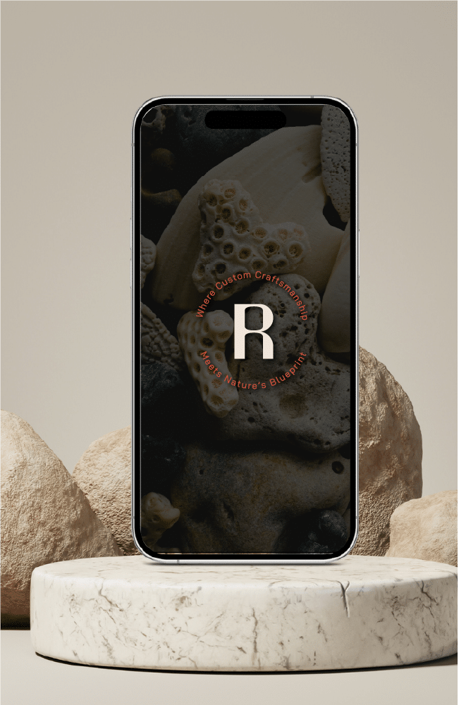
The coral
Coral’s intricate, organic shapes can symbolise the uniqueness of custom-built reflecting individuality in design. Incorporating coral-inspired textures and patterns into the branding will evoke personalisation and natural beauty. By using coral as a symbol of resilience, craftsmanship, and sustainability, Rinsed can convey a powerful message about the lasting value of well-crafted spaces.
Saj was amazing from start to finish with creating not only a new logo but also giving us brand identity!
As a new company I thought it was important to get our identity spot on from the start! Would highly recommend Saj for all aspects of branding! Will defiantly be using again in the future! Rinsed bathrooms!